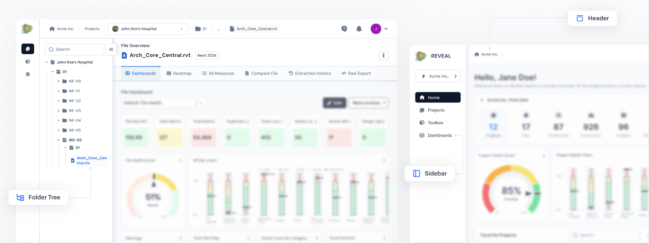
The role of navigation design
Navigation is the roadmap for digital products, shaping how users explore and interact with software. It ensures users can easily access features and information, reduces friction, and enables clear movement through even the most complex platform.
Smart navigation leans on familiar UI patterns - buttons, tabs, sidebars - to help users reach their goals quickly and intuitively.
Why navigation design matters
Poor navigation can leave users feeling lost or overwhelmed, making them less likely to stay engaged or get real value from the product.
In contrast, good navigation design can:
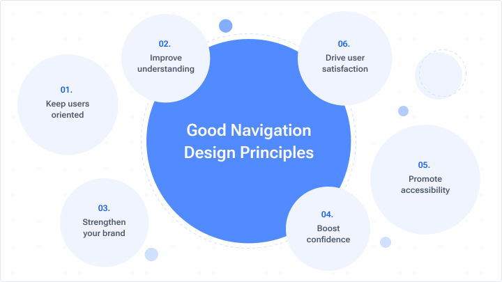
• Keep users oriented: Navigation serves as a guide, letting users always know where they are and how to reach their next destination. This reduces frustration and helps them feel more in control.
• Improve understanding: Effective navigation ensures users can move through your product with ease, helping them quickly find what they need and stay engaged.
• Strengthen your brand: A well-designed, easy-to-use interface leaves a great first impression and helps establish a strong, positive brand identity.
• Boost confidence: Straightforward paths and intuitive menus help users feel at home, inspiring them to explore what else you offer.
• Promote accessibility: Accessible navigation enables all users, including those with disabilities, to fully engage with your product, expanding your reach and showing you value inclusivity.
• Drive user satisfaction: The easier it is to navigate, the more enjoyable and satisfying user experience will be, leading to greater loyalty.
In Reveal, where users work with large volumes of complex project data, strong navigation isn’t just a nice-to-have - it’s a core requirement for keeping teams organized, efficient, and focused on the tasks that truly matter.
About Reveal
Reveal is a cloud-based B2B platform designed for data management in the AEC industry, specifically tailored for Autodesk tools.
It empowers project owners project owners, architects, engineers, BIM managers and design technologists with actionable insights, advanced analytics, and collaborative tools to enhance decision-making, optimize processes, and drive sustainable practices.
At Reveal, we put navigation first. Our commitment is to help everyone - no matter their role - get to essential data, fast.
Here’s how our navigation makes even the most complex AEC information clear, efficient, and always at your fingertips.
Three levels, one experience: organization, project, and file
In Reveal, we designed navigation around how real AEC teams work - projects are complex, teams are diverse, and each role needs its own perspective.
That’s why we structure everything around three distinct levels - organization, project, and file - making sure each user lands right where they need to be.
1. Organization Level:
This is where company owners and upper management see the full organizational landscape - every project, every team member, and access to the toolbox for broad oversight and strategic planning.
This is where company owners and upper management see the full organizational landscape - every project, every team member, and access to the toolbox for broad oversight and strategic planning.
2. Project Level:
Project managers, BIM coordinators, and team leads operate at this middle tier. The project level cuts through the noise, focusing only on data, files, and metrics related to a specific job. It’s where day-to-day progress is monitored, issues are resolved, and collaboration happens in real time.
Project managers, BIM coordinators, and team leads operate at this middle tier. The project level cuts through the noise, focusing only on data, files, and metrics related to a specific job. It’s where day-to-day progress is monitored, issues are resolved, and collaboration happens in real time.
3. File Level:
The file level is all about the details - engineers, architects, and technical specialists use it to dive deep. Whether it’s reviewing a specific Revit or Civil 3D file, checking extraction history, or tracking file-specific metrics, this level brings the project’s real working parts into focus.
The file level is all about the details - engineers, architects, and technical specialists use it to dive deep. Whether it’s reviewing a specific Revit or Civil 3D file, checking extraction history, or tracking file-specific metrics, this level brings the project’s real working parts into focus.
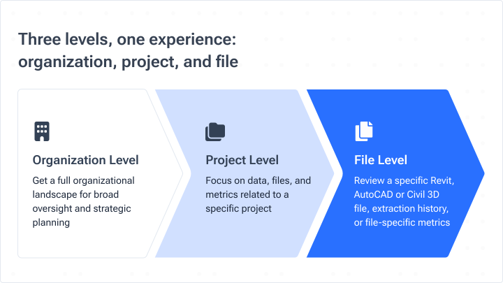
Each level is designed with its audience in mind, delivering personalized, relevant access to information. This approach keeps teams connected, workflows efficient, and decision-making sharper - no matter where users are working in the platform.
Combined navigation: header and sidebar
Organization level
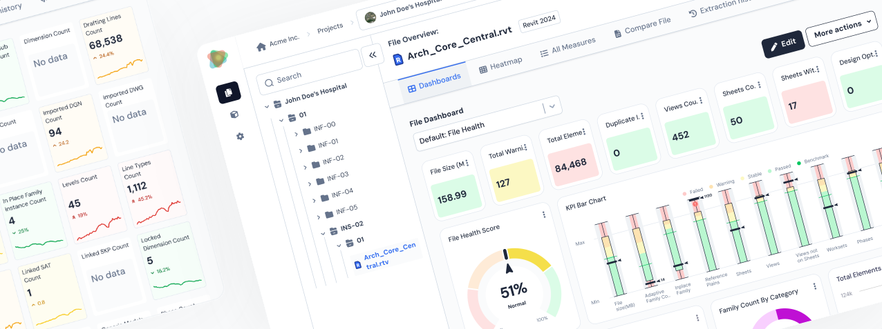
At the organization level, Reveal uses a combined navigation system that pairs a top header with a persistent sidebar. This layout organizes information in a logical way and supports users at every level.
• The header acts as home base for global actions - such as accessing your user profile, seeking support, or managing account settings. No matter where you are on the platform, these tools remain just a click away, offering consistency and continuity in navigation.
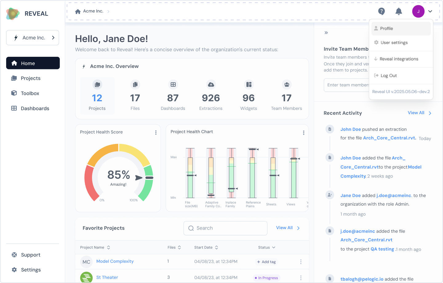
• The header also includes a breadcrumb trail: a row of clickable links separated by arrows, showing your place within the platform’s hierarchy and making it easy to jump back to higher-level sections.
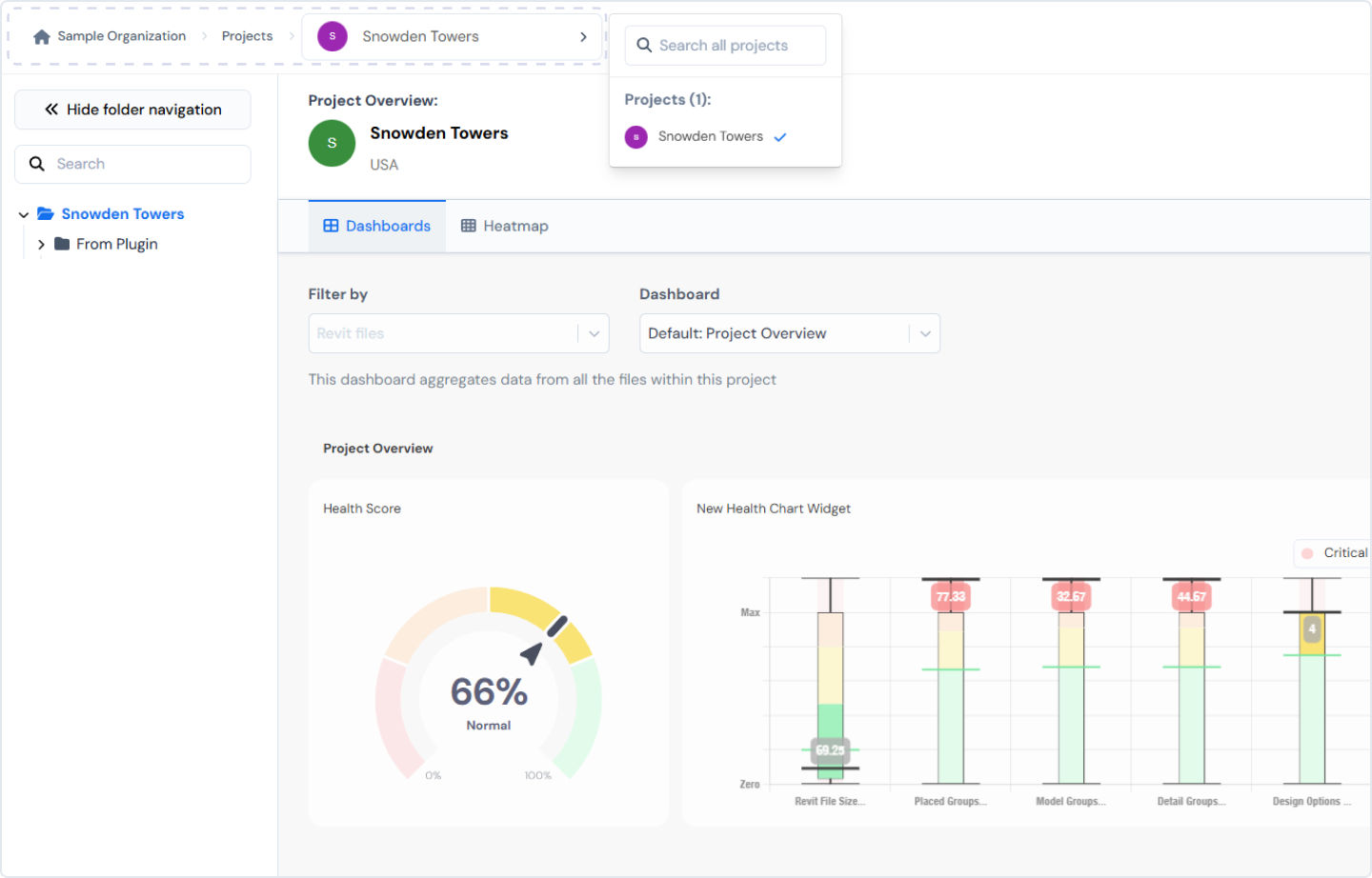
• Next to the header is the sidebar, which provides context-aware links that stay visible as you work. The sidebar is the main highway through Reveal: quickly access projects, dashboards, tools, organizational settings, or support without losing your sense of direction.
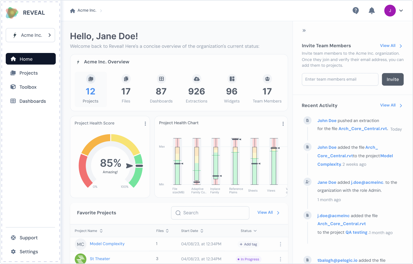
This combination of global navigation from the header and contextual links from the sidebar ensures users always feel anchored. This layout is more predictable and consistent, making it easy to learn for new users and to navigate for experienced users.
Project Level
To accommodate different ways teams work, we deliberately separated organization and project levels, so users “dive in” to the project view and see a tailored experience. This decision was based on actual usage patterns and role-specific feedback.
• Here, the sidebar shrinks automatically when a user enters a project, presenting a cleaner workspace.
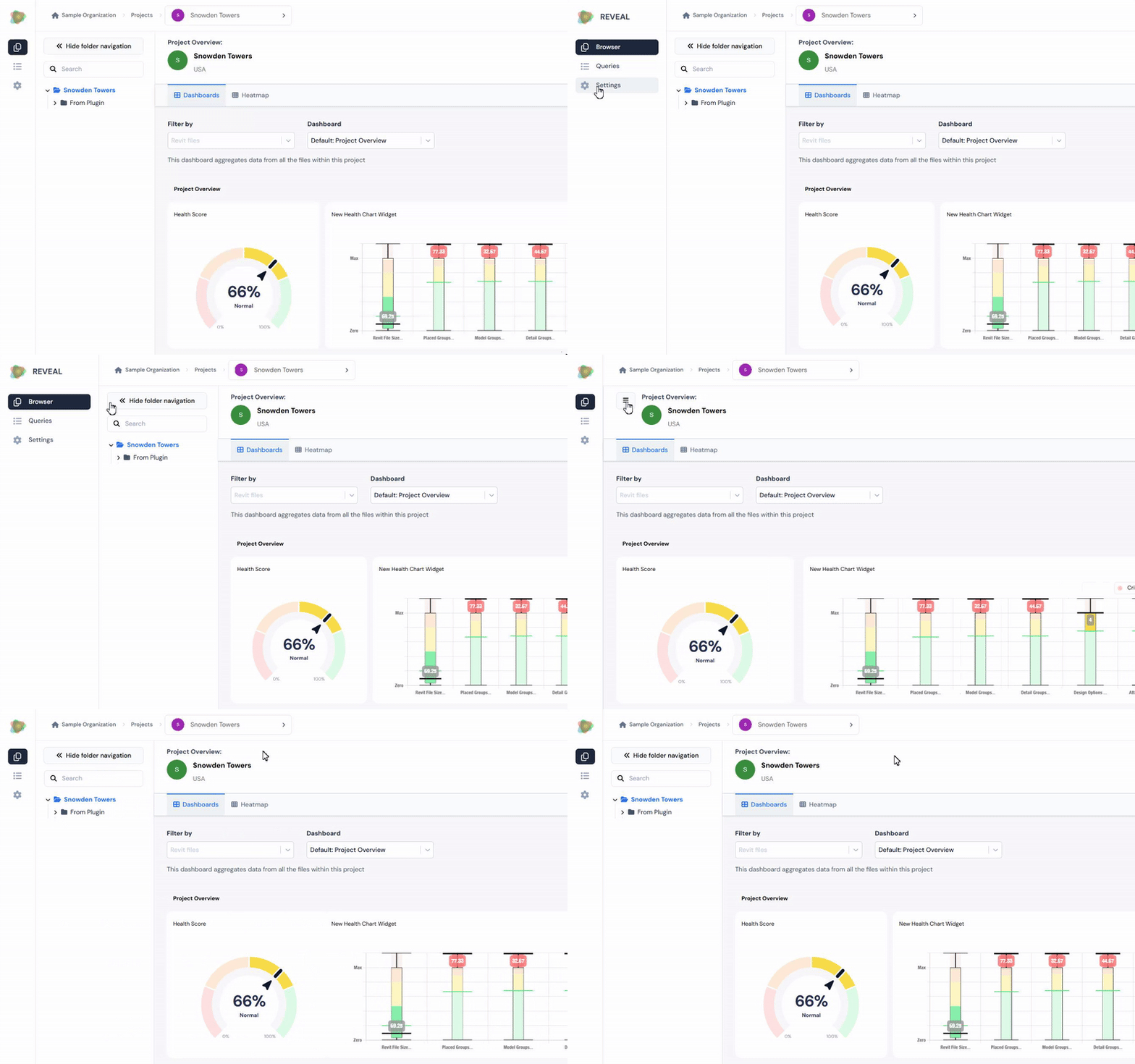
• After conducting user research and listening to feedback, we added folder tree navigation to Reveal, following familiar patterns from tools like ACC/BIM 360. This allows users to view and organize project data in a structure they already know, making everyday navigation clearer and more efficient.
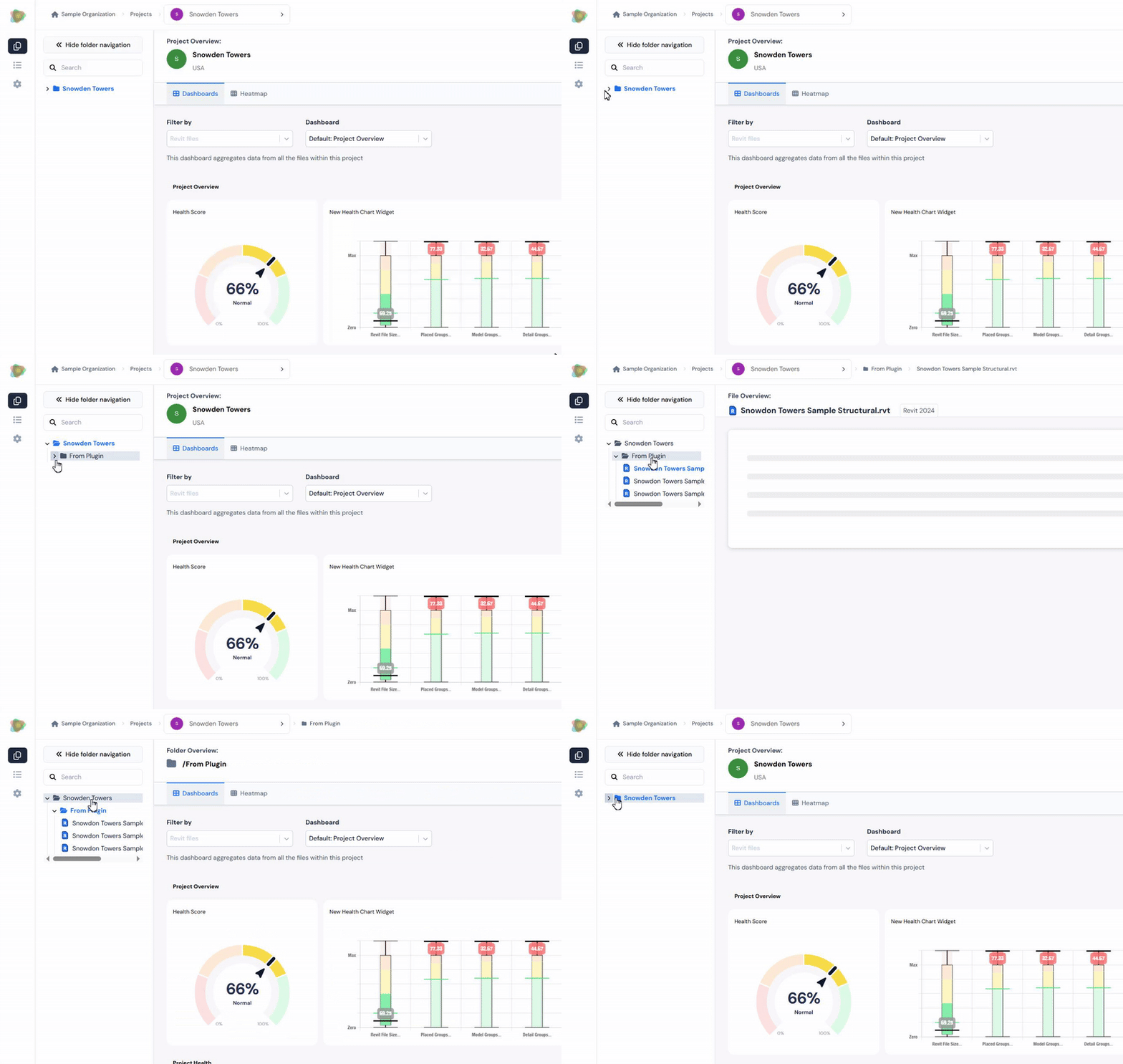
Altogether, this navigation ecosystem makes Reveal powerful yet approachable, supporting anyone to work confidently - even as project data and needs grow in complexity.
Navigation in the dashboards
Navigating within Reveal dashboards is designed to be clear and efficient, helping users instantly access the views and actions they need without clutter or confusion.
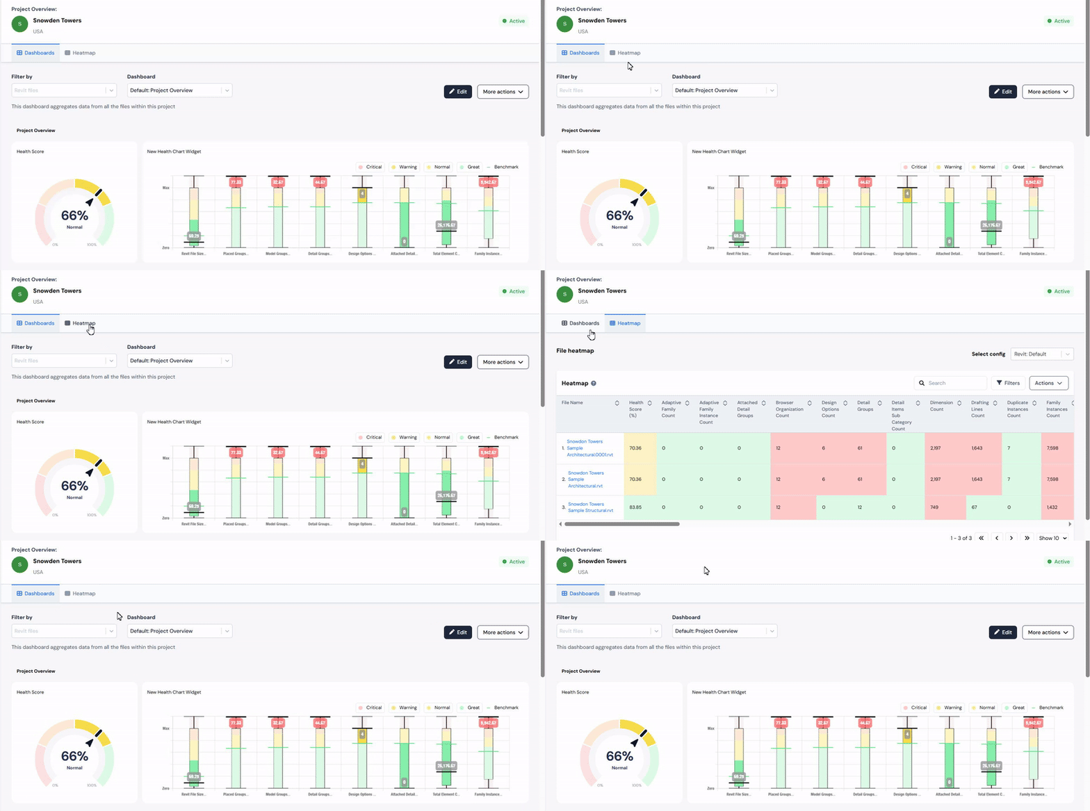
• Tabbed navigation sits at the top of each dashboard, letting users flip between views (Dashboards, Heatmap, etc.) with one click. The chosen content comes forward, while the rest quietly stays out of sight.
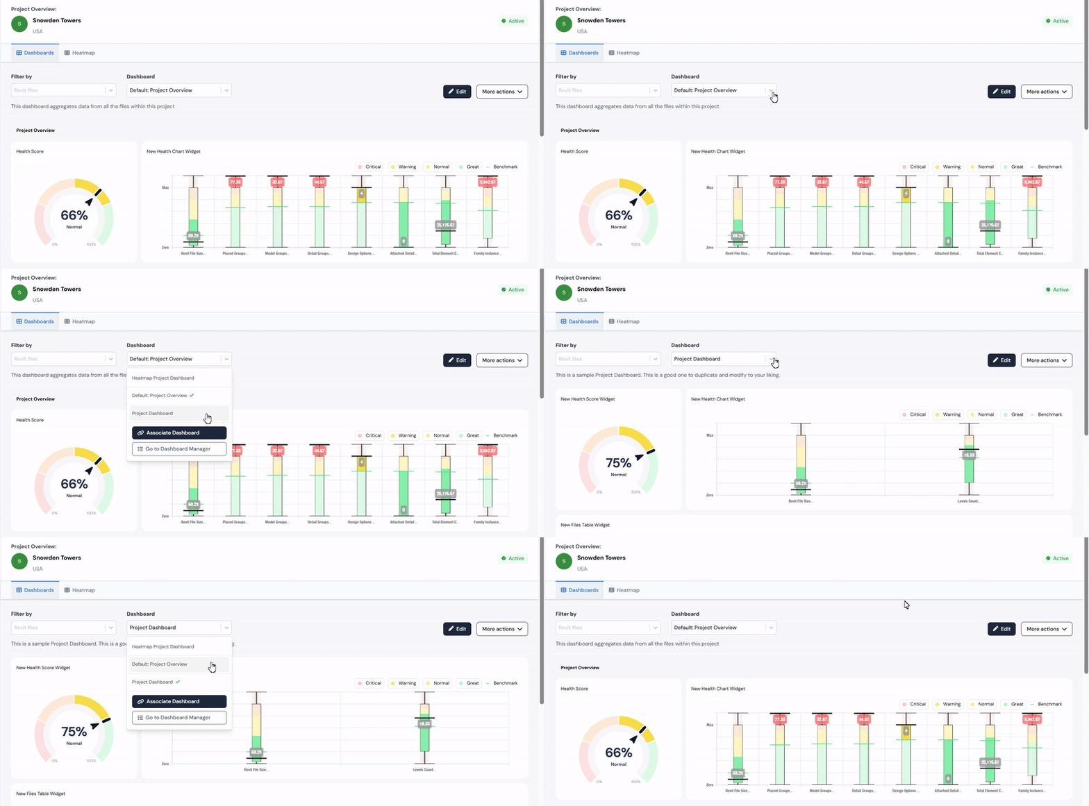
• Dropdown menus make navigation even faster. Users can select file types or switch dashboards easily, keeping the interface simple by showing more options only when required, and not overwhelming the user from the start.
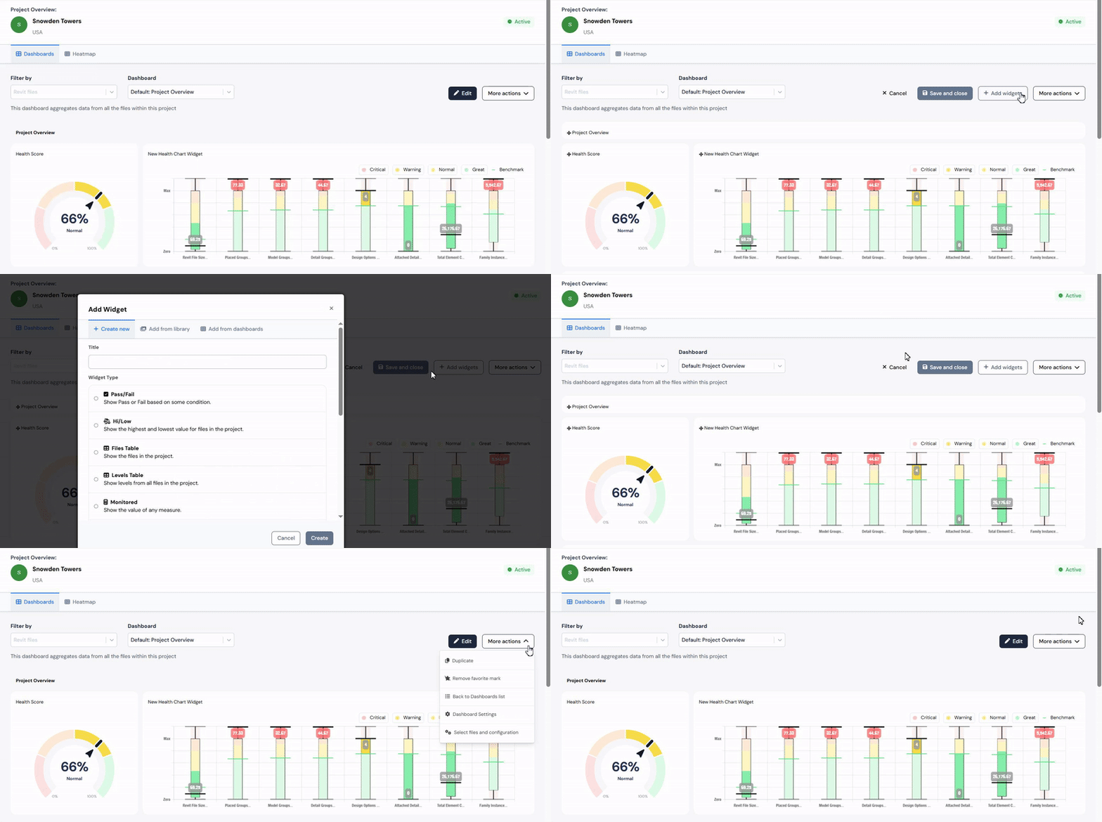
• Additionally, action controls on the top right of every dashboard provide important tools right where you need them.
◦ Edit button makes updating or personalizing dashboards fast and easy.
◦ More Actions button bundles advanced features like Duplicate, Dashboard Settings, and more - offering instant access to powerful tools without cluttering the main view.
With these layers of navigation, Reveal dashboards remain clean, organized, and intuitive - helping users focus on insight, not just on where to click.
Navigation details that enhance users focus
In Reveal, every element of navigation is carefully chosen to keep users focused on their tasks, not on learning the interface. By emphasizing minimalism, we keep the workspace free from visual clutter, allowing key navigation tools to stand out and making the environment open and approachable.
1. Icons used in tabs and buttons are selected for their instant recognizability, so users can quickly understand the function of each option. Essential functions are placed where users intuitively expect them, reducing the time spent searching for actions or information.
2. Subtle visual cues like hover states or highlighting guide users as they move their cursor, showing what can be interacted with.
3. To further enhance clarity, we include tooltips throughout the navigation. When users hover over an icon or button, a brief explanation appears, providing extra guidance without occupying space or overwhelming the design.
These choices might seem small, but together they create a seamless navigation experience - making it easier for users to stay oriented, move quickly, and concentrate on meaningful work rather than on finding their way.
Tips & best practices for designing complex navigation
Designing navigation for complex, data-rich platforms - especially for B2B in AEC environment - comes with its own set of challenges.
Here’s what we've learned at Pelogic, plus a few practical tips for others designing similar platforms:
• Start with user research: Real workflows and stories should guide all navigation decisions. Talk to your users (if possible), study how they actually work, and look for inspiration in industry research - even on YouTube.
• Feedback loops matter: Usability testing isn’t a one-and-done task. Test navigation early and often, invite ongoing feedback, and make it easy for users to share their thoughts as navigation patterns evolve.
• Prioritize clarity: Minimal, clear labeling and well-known patterns (tabs, sidebars, breadcrumbs) help users feel at home. Stick to what works unless there’s a good reason to innovate.
• Design for scalability: Build navigation that won’t buckle as your product grows. Think about how adding future features will affect the menu system or site structure.
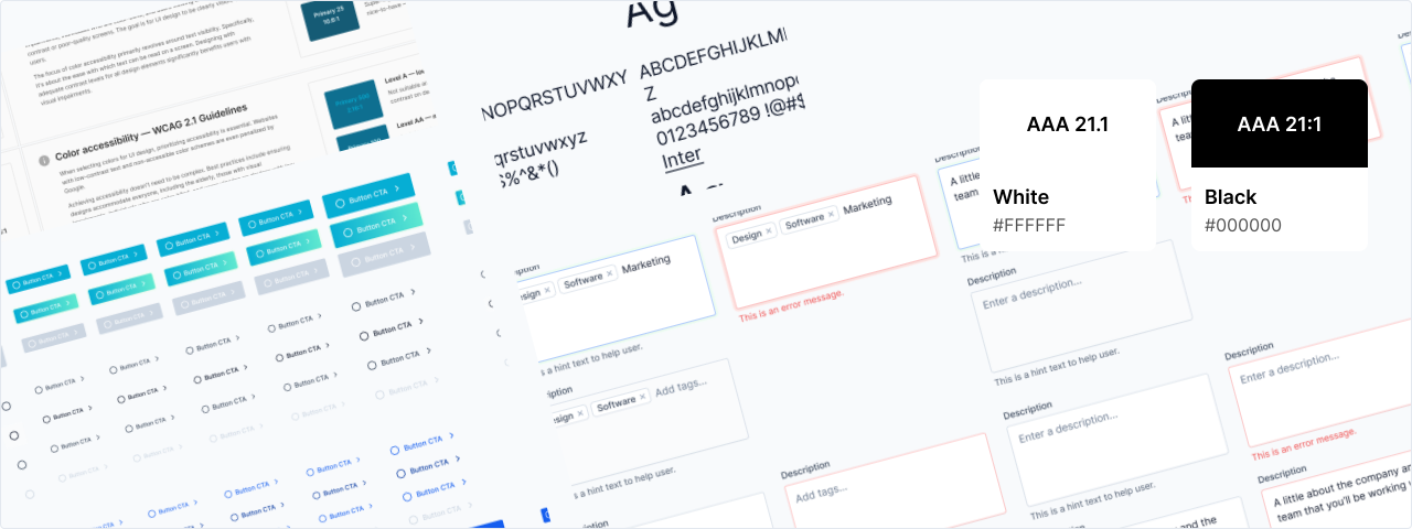
• Consistent visual language: Use a unified set of icons, fonts, and styles throughout the platform, so users don’t have to relearn navigation elements as they move around.
• Documentation and training: Even great navigation can take some getting used to. Provide tooltips, onboarding walkthroughs, and help docs to shorten the learning curve and build user confidence.
Thoughtful navigation isn’t just about menus and links - it’s about empowering users at every stage, reducing cognitive load, and making even the most complex tasks feel manageable. That’s the heart of effective UX in enterprise software.
Final thoughts
In complex platforms like Reveal, intuitive navigation isn’t just a bonus - it’s a necessity. When users can move seamlessly through organization, project, and file-level data, it becomes easier to focus, collaborate, and act decisively, no matter how much information is in play.
Reveal’s navigation is built for real-world AEC workflows, using industry-familiar patterns and responsive design to boost productivity, clarity, and user confidence. Details like breadcrumbs, sidebar controls, and minimalist icons are all there for one reason: to keep users working smoothly and distraction-free.
At Pelogic, we know that successful software starts with great navigation. That’s why we help clients lead with smarter, more efficient, and data-driven decisions by making sure everyone always knows exactly where they’re going next.

Olena
UI/UX & Product Designer