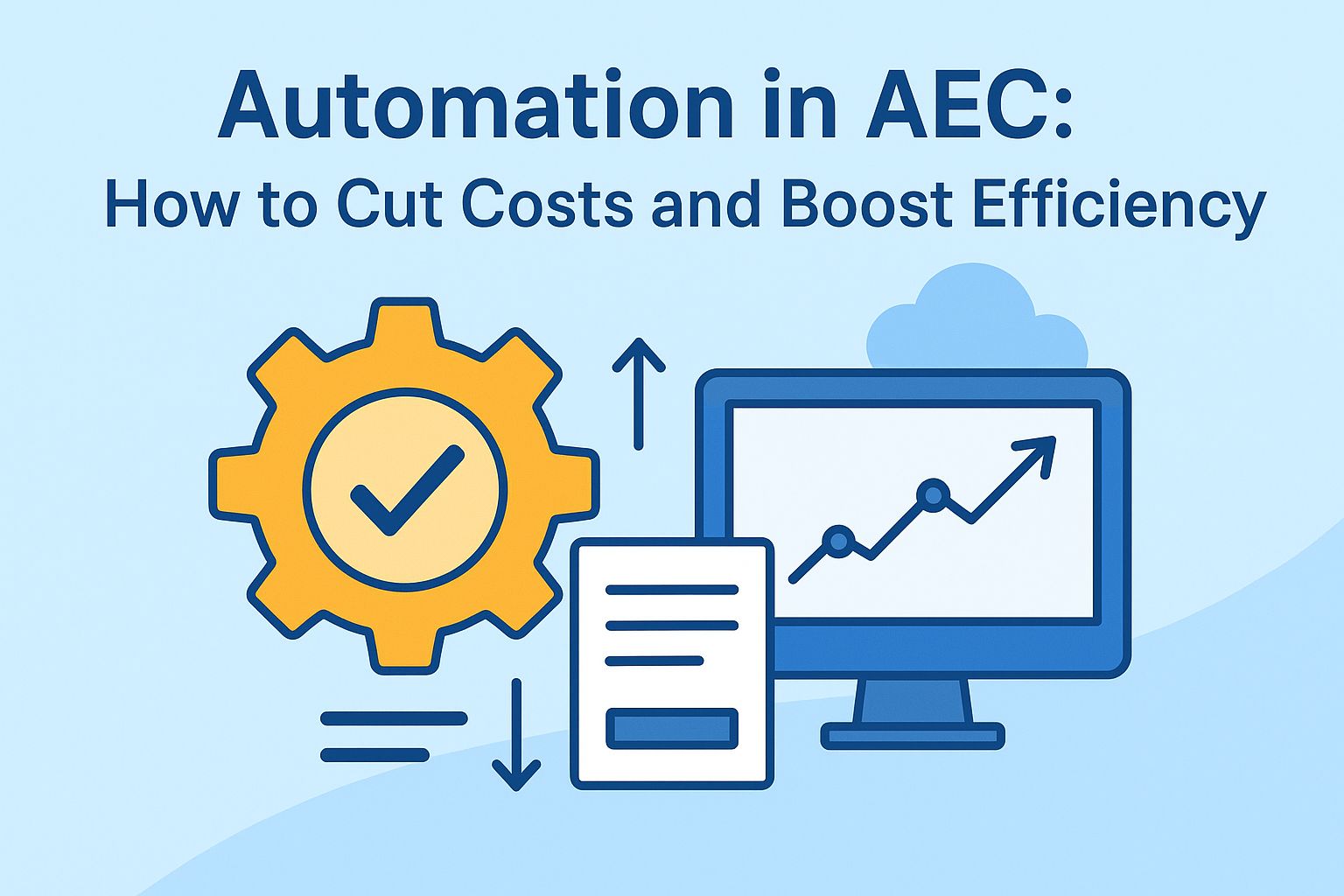
That's the core philosophy behind Reveal, our cloud-based B2B platform for AEC industry data management. By making information visual and accessible, Reveal helps decision-makers find insights fast and drive better results.
Understanding data visualization
Visualizing data is essentially about taking complex information and turning it into clear, engaging visuals like charts and tables. Our minds process color and shape naturally - so using circles, lines, and other forms to represent data points helps users spot patterns, group information, and act quickly. Effective data visuals cut through the noise, revealing what really matters underneath.
Within Reveal, visualization isn’t just a helpful add-on, it’s vital to our work. It brings clarity and efficiency to the AEC data landscape and makes it easier for teams and stakeholders to communicate and collaborate.
About Reveal
Reveal is a cloud-based B2B platform designed for data management in the AEC industry, specifically tailored for Autodesk tools.
It empowers project owners project owners, architects, engineers, BIM managers and design technologists with actionable insights, advanced analytics, and collaborative tools to enhance decision-making, optimize processes, and drive sustainable practices.
The goal - to help everyone involved in a project make better decisions, streamline processes, and achieve more sustainable outcomes.
Role of dashboards in Reveal
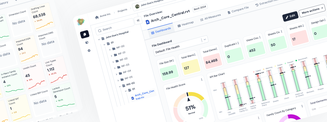
Dashboards are at the heart of our approach in Reveal. They bring together all the essential project metrics in one place, letting teams monitor progress, spot issues, and act fast. Instead of drowning in endless spreadsheets, you get a focused view that highlights what matters most.
Our dashboards are built for a diverse audience - project managers, BIM managers, and engineers all get information tailored to their needs at a glance. Having the right data up front means teams can make strategic decisions without second-guessing or delay.
Building effective dashboards - our approach
The goal was to design dashboards that are simple and intuitive, allowing users to quickly benefit from the platform without spending time learning how to navigate it.

Best practices include:
• Effective visuals: We carefully pair the right chart with the right data. Donut charts, for example, show parts of a whole at a glance. Line graphs are perfect for illustrating changes over time. Getting this match right is crucial for insight and clarity.
• Simplicity and accessibility: We keep dashboards clean and focused. Only essential information, clear labeling, and accessible colors/fonts are used, ensuring everyone - including those with color vision challenges - can use and benefit from the platform.
• User focus: Our dashboard creation process was user-centric. We conducted numerous interviews, conversations, and usability tests with users, understanding their goals and refining data presentation based on feedback. For example, while BIM managers often prefer high-level dashboards on the organization or project levels, engineers may need more granular visualizations on the file level, to uncover patterns or metrics trends.
• Consistency: We applied consistent metrics, language, and styles - including standardized colors, fonts, and CTAs - across all dashboards. This keeps navigation easy and helps users spot trends.
• Sustainability: Data changes all the time. Our dashboards are built for easy updates, whether that’s automated (using BIM 360/ACC Design Automation) or manual (via our desktop plugin).
• Context: To turn data into actionable information, we compare key metrics with industry standards or benchmarks - adding that crucial context for smarter decisions.
Challenges and solutions
Transitioning from design ideas to real-world use brought its own set of challenges - here’s how we tackled them:
1. Design consistency
Delivering a uniform look across all dashboards was challenging. We established clear design guidelines early - setting rules for color, font, and visual elements - to keep the look cohesive throughout.
Delivering a uniform look across all dashboards was challenging. We established clear design guidelines early - setting rules for color, font, and visual elements - to keep the look cohesive throughout.
2. User-centered design
Catering to the diverse needs of users, from BIM managers to engineers, required a tailored design approach. We conducted in-depth user research and usability tests to grasp user requirements, allowing us to create designs that are intuitive and effective.
Catering to the diverse needs of users, from BIM managers to engineers, required a tailored design approach. We conducted in-depth user research and usability tests to grasp user requirements, allowing us to create designs that are intuitive and effective.
3. Visual clarity
The temptation to show every possible bit of data was strong - but clarity comes first. We prioritized essential information and used visual hierarchies to focus attention on key insights, avoiding information overload.
The temptation to show every possible bit of data was strong - but clarity comes first. We prioritized essential information and used visual hierarchies to focus attention on key insights, avoiding information overload.
4. Responsive design
Dashboards had to look and work great on different devices. Our designs are flexible and responsive, adapting to diverse screen sizes for a uniform user experience.
Dashboards had to look and work great on different devices. Our designs are flexible and responsive, adapting to diverse screen sizes for a uniform user experience.
5. Customization and flexibility
Users often want to tweak and tailor dashboards. By designing modular components, we give users tools to customize their views, select their metrics, and adjust layouts for their workflow.
Users often want to tweak and tailor dashboards. By designing modular components, we give users tools to customize their views, select their metrics, and adjust layouts for their workflow.
Addressing these design challenges helped us deliver dashboards that are not only visually appealing but genuinely improve the way users work and make decisions.
Types of data visualizations
Dashboards in Reveal use highly configurable widgets to track, analyze, and manage metrics at every level - organization, project, or file.
Widgets form the core of each dashboard, offering instantly understandable insights through charts, tables, and key performance indicators (KPIs). Each widget is designed to highlight and consolidate critical data, ensuring users have access to real-time, actionable insights.
Widgets use various chart types, such as:
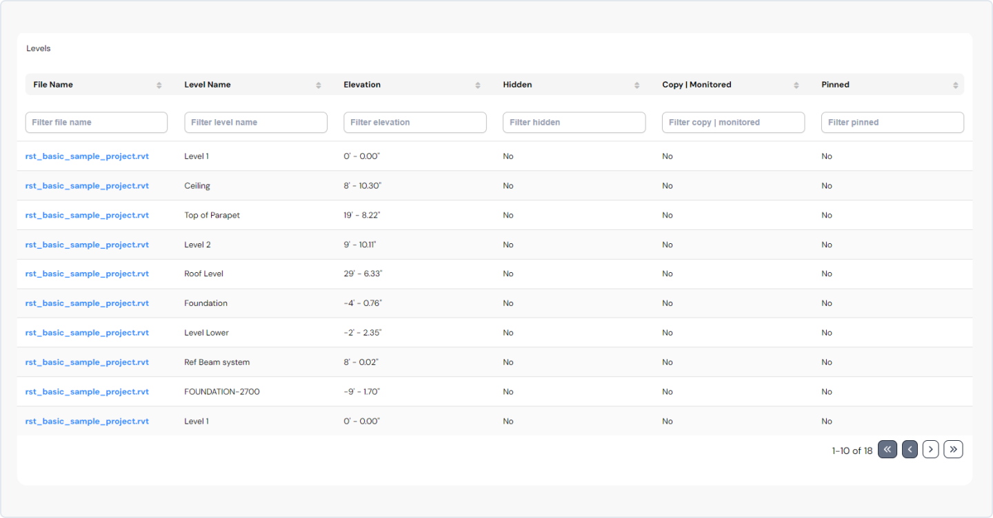
• Tables: For organized, supplementary information - great for files, collection lists, and levels. Reveal offers different widgets containing tables, like Files, Collection Lists, and Levels.
• Line Charts: Pinpoint trends and metric changes over time.
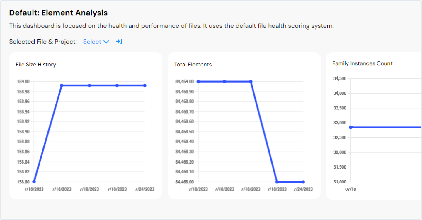
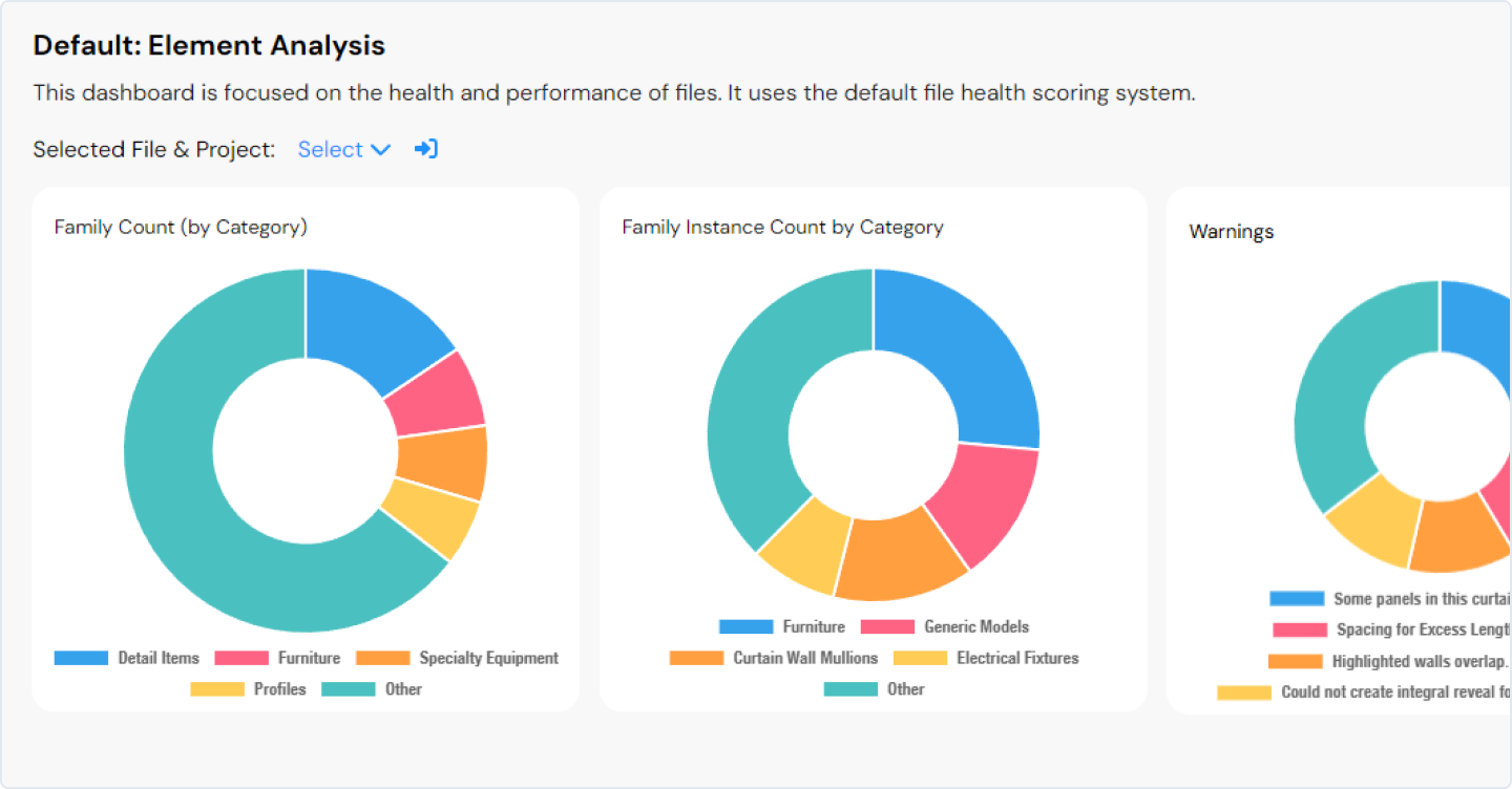
• Donut Charts: Divided into sections representing parts of a whole, with a blank center, these charts provide a comprehensive overview of specific metrics. They are especially useful for comparing proportions, allowing users to quickly identify major contributors and outliers.
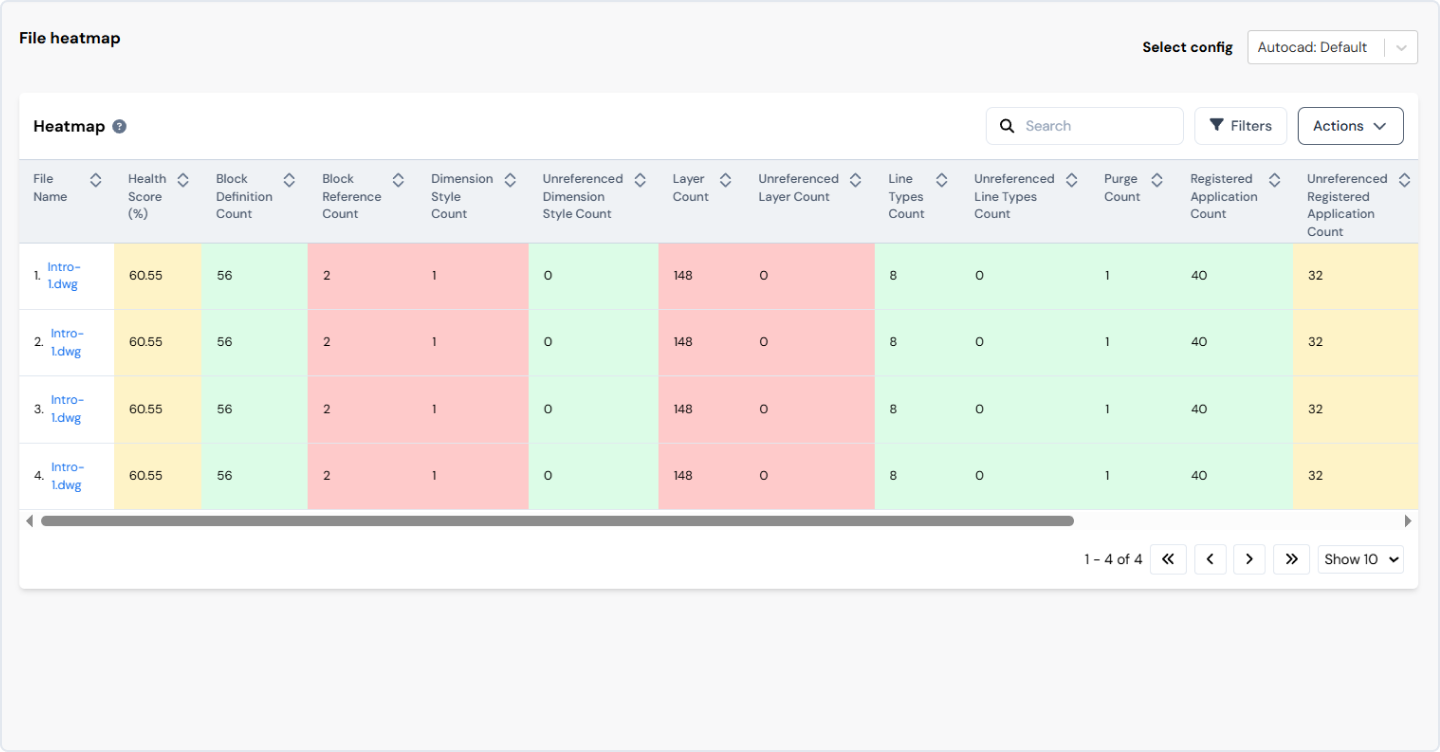
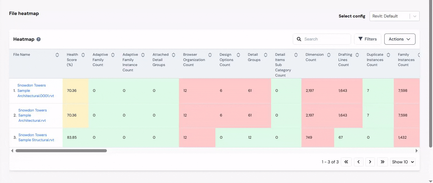
• Heatmaps: Use colors to represent and consolidate project performance by evaluating indicators like file size, warnings etc. across all project files. The results are visualized in a heatmap table.
For more advanced needs, we include:
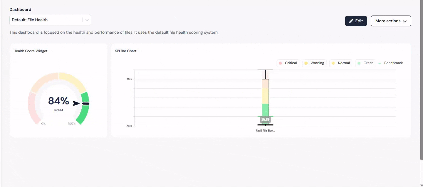
• KPI charts: Display grid-style overviews of KPI values for each category. They consolidate project performance by assessing critical indicators such as file size, warnings, and numerous other file-specific metrics. Users can customize the widget, including "health" settings, to match their unique requirements and preferences.
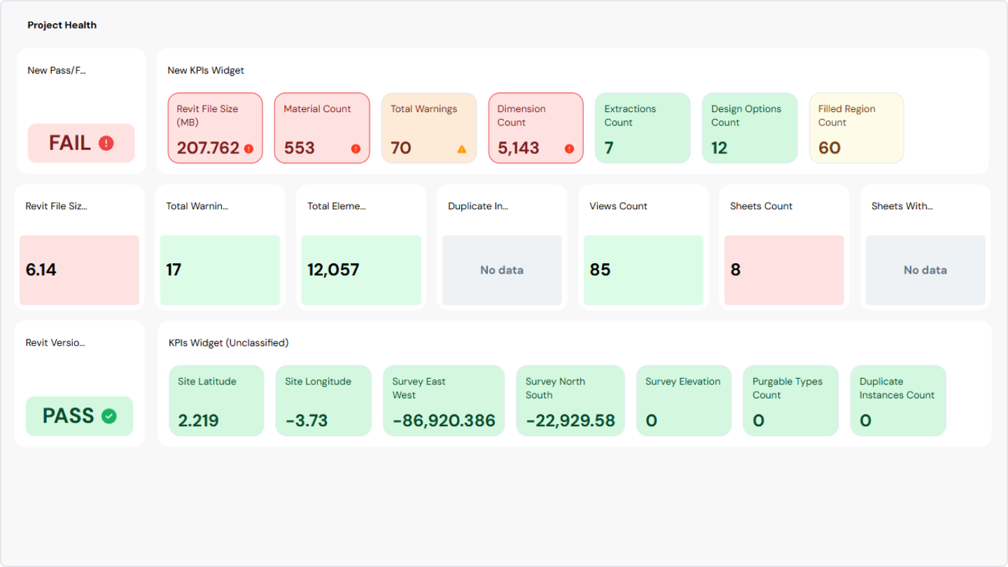
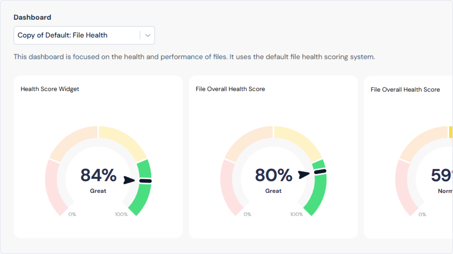
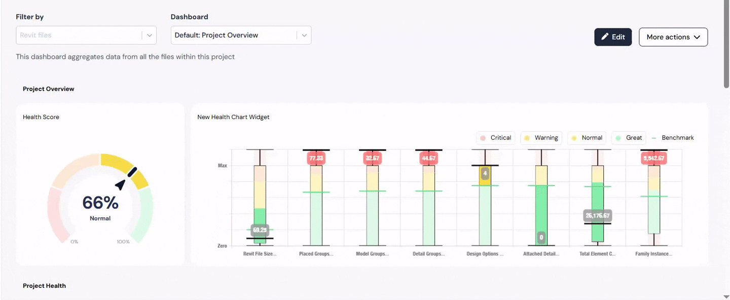
• Gauge charts (or Health Score): Summarize and aggregate overall project performance by evaluating key indicators such as file size, warnings, and various file-related metrics. They offer a quick, comprehensive view of project or file status. Its functionality is based on the Health Score Configuration, which ensures that the analytical data it provides meets the unique requirements and standards of the client.
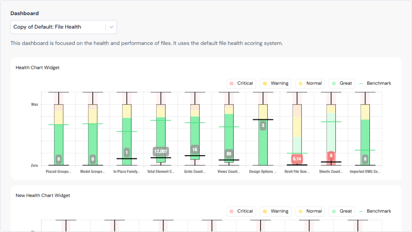
• Box Plot (Box-and-Whisker Plot): Indicates the distribution of data based on a five-number summary: minimum, first quartile, median, third quartile, and maximum. Designed to assess and visualize key metrics, including file size, warnings, and a variety of other file-specific metrics. Users can customize it according to their preferences, leveraging the settings configured in the Health Score Configuration.
Core features of our dashboards
1. Navigation
Intuitive paths, clear labels, predictable layouts, and logical groupings help users find what they need quickly.
Intuitive paths, clear labels, predictable layouts, and logical groupings help users find what they need quickly.

2. Filtering and sorting
We let our users interact with dashboards by providing filters and controls. This enables users to focus on particular areas of interest, tailor their view, and dig deeper into the data.
We let our users interact with dashboards by providing filters and controls. This enables users to focus on particular areas of interest, tailor their view, and dig deeper into the data.
3. Customization
Giving end users control to adjust time periods, comparisons, and exports ensures the dashboard adapts to different needs - without adding clutter.
Giving end users control to adjust time periods, comparisons, and exports ensures the dashboard adapts to different needs - without adding clutter.
4. Interactivity
Our dashboards are dynamic, letting users click, filter, and engage with user’s data to discover new insights.
Our dashboards are dynamic, letting users click, filter, and engage with user’s data to discover new insights.
5. Drill-down functionality
Our drill-down functionality transforms widgets and charts into meaningful representations, enabling users to explore each metric and its trends in detail.
Our drill-down functionality transforms widgets and charts into meaningful representations, enabling users to explore each metric and its trends in detail.

Key benefits of data visualization with Reveal
• Make informed, data-driven decisions: Analyze critical data from Revit, AutoCAD, and Civil 3D files without opening each one manually. By understanding information and collaborating to reveal insights and patterns, the days of relying on intuition for quick decisions are over.
• Gain quick insights: Drill-down features reveal trends and anomalies instantly, helping teams act fast.
• Facilitate seamless collaboration: Visual representations close the gap between teams and stakeholders by sharing real-time data insights and visualizations.
• Empower everyone: Interactive dashboards and a unified data environment mean everyone gets the same clear, insightful view - no matter their role.
• Increase project value: While data is valuable, team members often lack the time to learn complex analytics tools. Reveal makes analytics intuitive and accessible, helping teams unlock the full value of their data.
Leverage Reveal, and you’ll see information transformed - not just into visuals, but into real business value.
Final thoughts
Effective dashboards are at the heart of smart, collaborative work in the AEC world. They not only turn complexity into clarity, but lay the groundwork for better decisions, innovation, and teamwork.
Whether you’re tackling a massive project or refining workflows on a smaller scale, investing in modern data visualization is the way to unlock the full power of your data.
At Pelogic, we're dedicated to transforming data into powerful tools for success. Our expertise in data visualization and the AEC industry ensures you're equipped with the insights you need to thrive. We're not just building dashboards, we're building the future of data-driven decision-making together.

Olena
UI/UX & Product Designer